 Mar
06
Pantone Color of the Year 2017
- March 6, 2017
- 0 Comment(s)
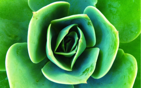
A refreshing and revitalizing shade, a symbol of new beginnings. Pantone color of the Year 2017 is “Greenery 15-0343.”
Every year since 2000, the company has chosen a color that reflects the current cultural climate. In the following year, the color has historically influenced trends in all facets of design—architecture, interior décor, fashion, food, travel—the list goes on.
Greenery signifies beginnings: a fresh New Year; healthier food resolutions and growing vegetarian trends; grass and the outdoors during spring and summer.
But most prominently, the yellow-green hue (specifically, Pantone 15-0343) comments on the concept of “environment.”
According to pantone.com, Greenery is described as “a fresh and zesty yellow-green shade.” Resembling nature, and spring time, when nature is starting to bloom again and the grass and trees turn to a fresh green color. Greenery is nature’s neutral. It’s versatile and can be mixed with many color combinations. Greenery can be paired with other neutral shades, brighter colors, pastels, metallics, and even deeper shades.


Ultimately, Greenery calls to mind the ‘re-’ words: refresh, revive, restore, renew, replenish, regenerate, rejuvenate, reinvigorate, re-oxygenate. Design is an outlet for all of these fresh beginnings. And the yellow pigment in Greenery references the sun, the symbolic light that people need in these times.
Information also provided by Forbes.com, full article can be read here. http://www.forbes.com/sites/karenhua/2016/12/09/pantones-color-of-the-year-2017-greenery-symbolizes-a-fresh-start-fashion/#5b5709bb1cda

